Linked Open Data Visualization
What is Linked Open Data?
Linked Open Data (LOD) is an effort to connect various open RDF datasets with each other. Back in 2001 Tim Berners-Lee described his vision of the Semantic Web. He saw already that data needs to be interconnected and machine readable. With the quickly growing number of linked open datasets his vision is coming true.
Visualization
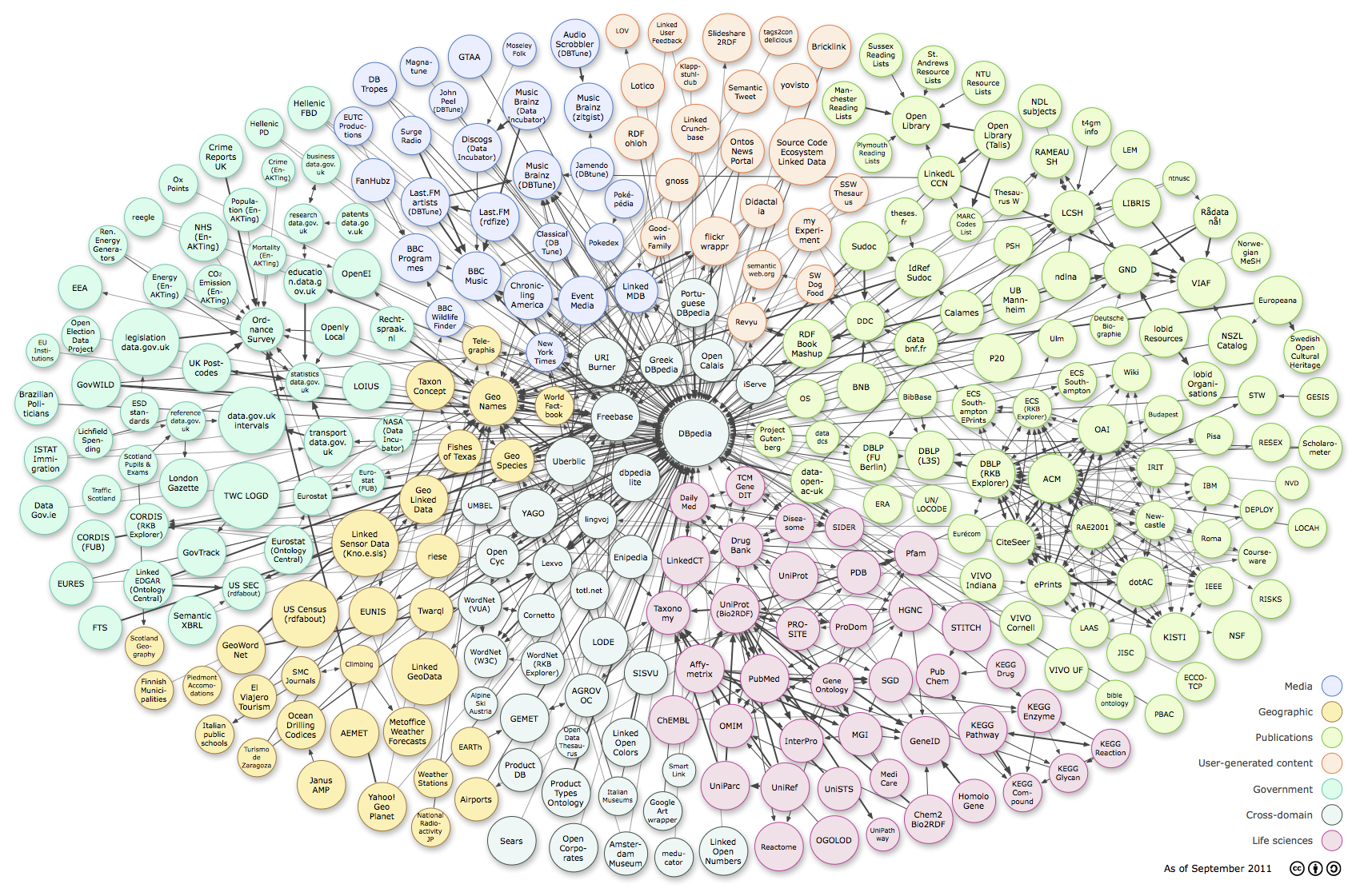
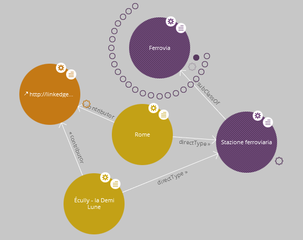
Usually the LOD cloud is visualized with bubbles (the RDF datasets) and lines (the links between the datasets). The following two graphics are examples of these visualizations.
The visualization by Richard Cyganiak and Anja Jentzsch (see also here):

Lodlive created a beautiful interactive visualization if you want to actually browse the cloud (click the image to get to the interactive version):

Based on the W3C Linked Open Data statistics, we created an interactive visualization of the linked data on the Web.
Controls:
- Hover over dataset: highlight all data sets it is connected with
- Left click and move: move the data sets
- Mousewheel: zoom in/out
- Right click and move up/down: zoom in/out
- Right click: zoom to see all data sets
Recommended Reading

The book "Linked Data" was co-authored by Christian Bizer who is a leading expert in the area of Linked Data. He is best known for his affiliation with the DBpedia project which is the backbone of the linked open data cloud (see the first visualization on this page).
The book is a "must read" for anyone who wants to understand and use linked data. The future of the Web lies in more machine intelligence and the linked open data cloud is the first step in this direction.
If you know of another visualization, let us know!
